During our first week at MI-Lab, it was all about boot camp. 12-hour work days, lots of carving, inking, paste application.
We didn’t have a lot of time to think about design- basically, we were asked to create a simple idea that could quickly be used to explore the technical aspects of Mokuhanga.
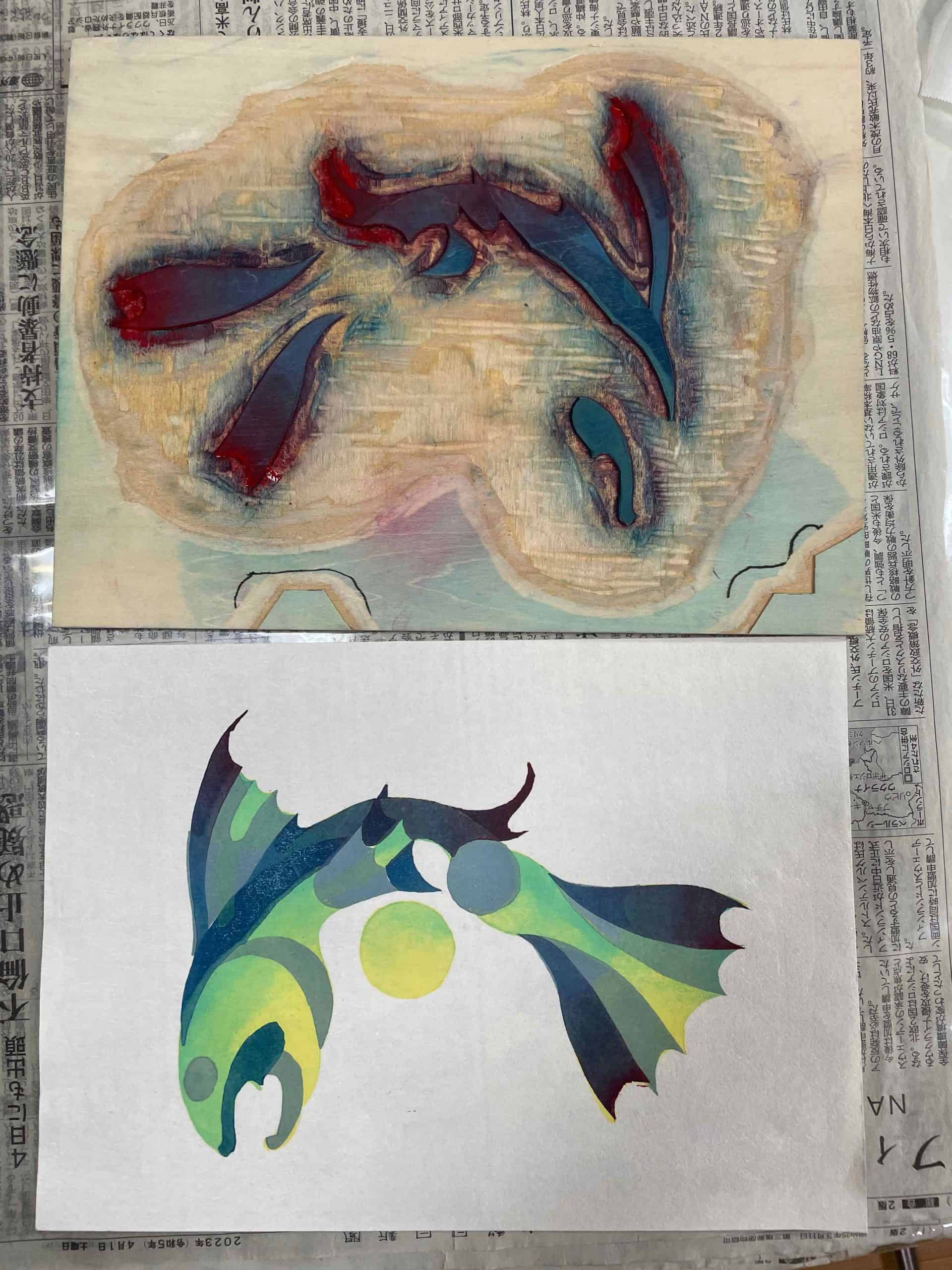
Whenever I’m presented with a rapidfire exercise like this, I revert to fish. Fish swim across a thosand of my pots… so why not paper?
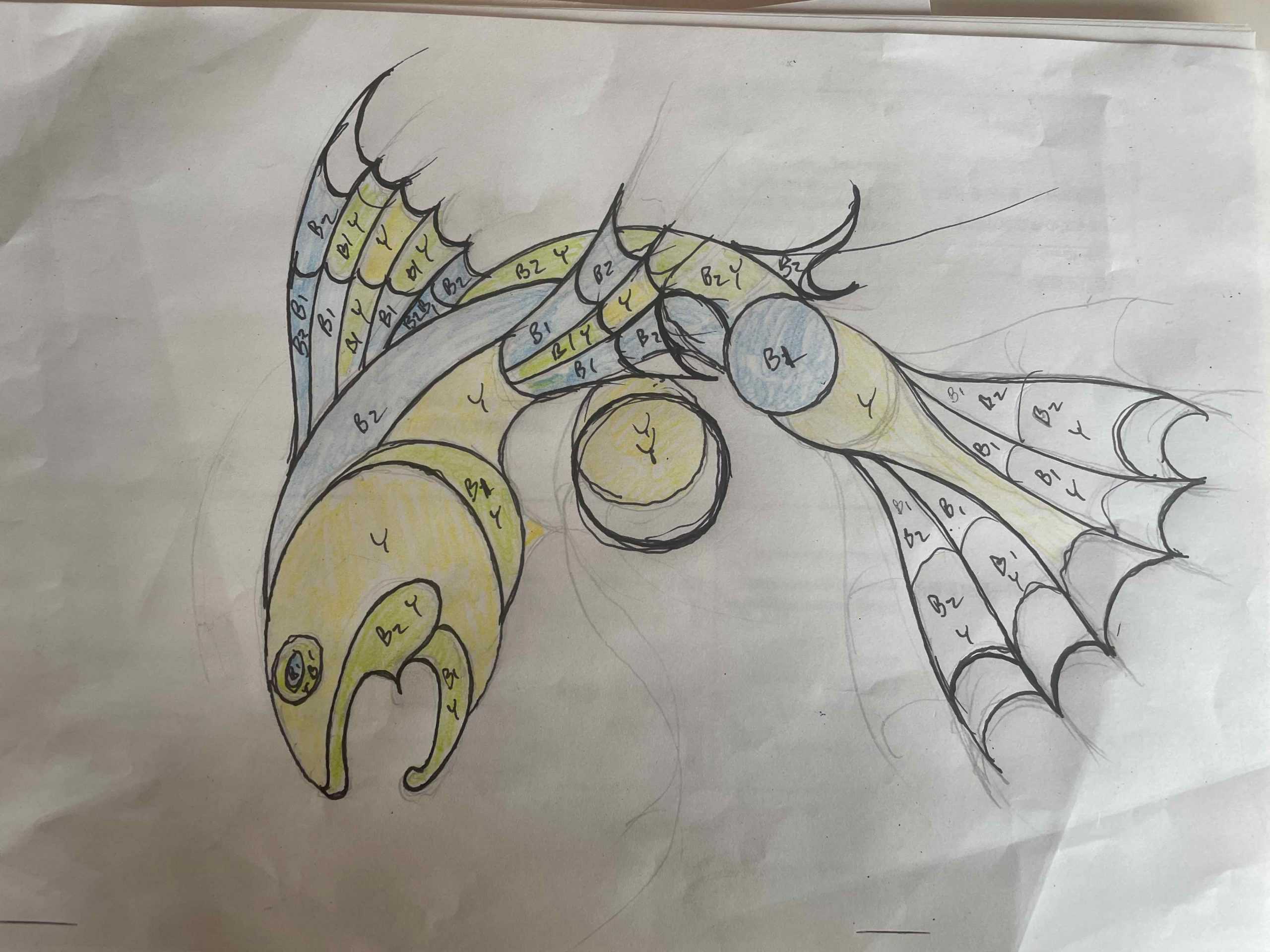
In Mokuhanga (as with most printmaking) you have to think about the interaction between different inks- color combinations, gradients, textures. This was the initial rough design….
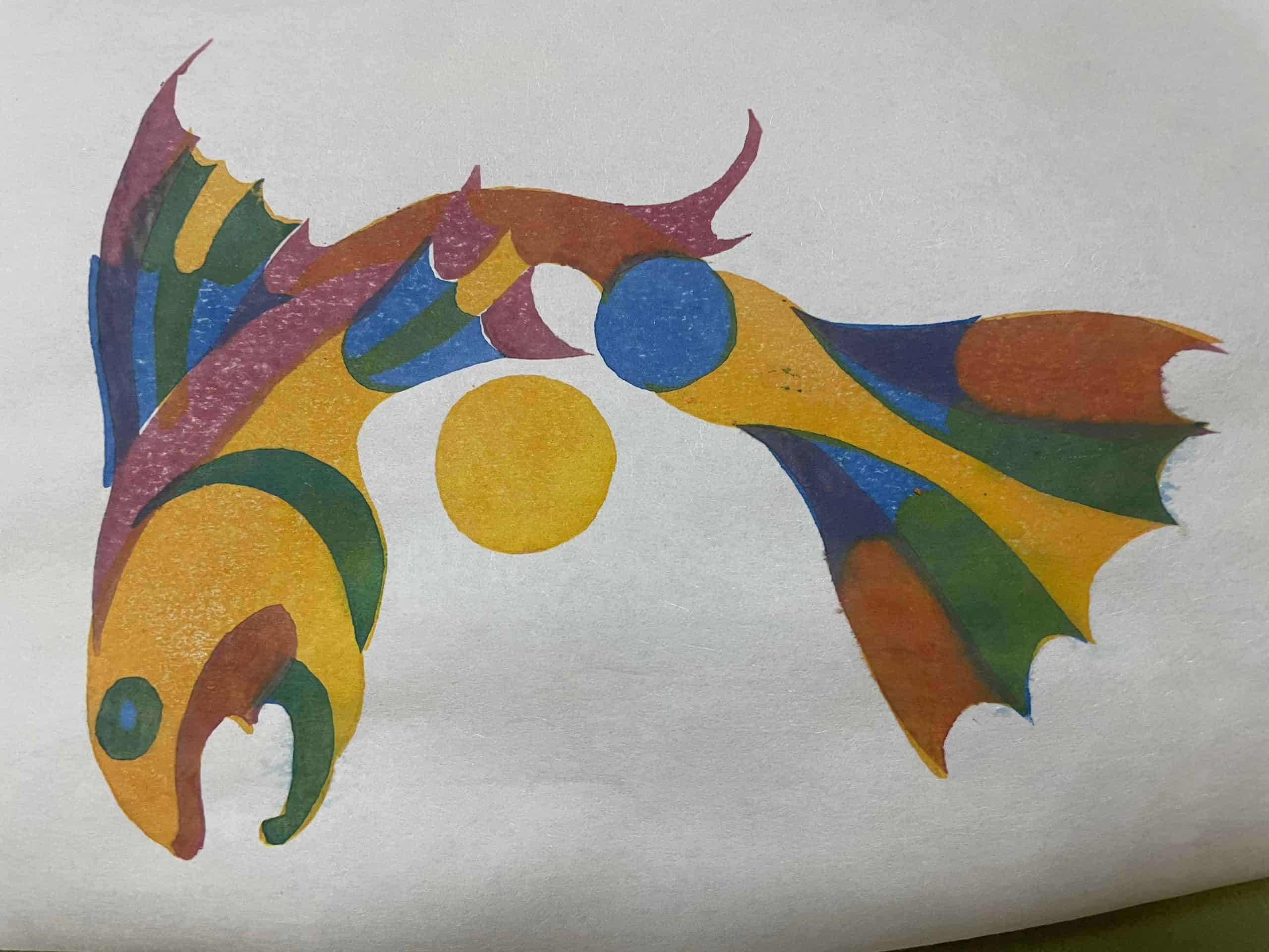
The simplicity of the design nonwithstanding, I was not happy with the first printed iteration of the design. The colors were flat- it honestly looked like a construction paper assemblege from a 3rd grade art fair.
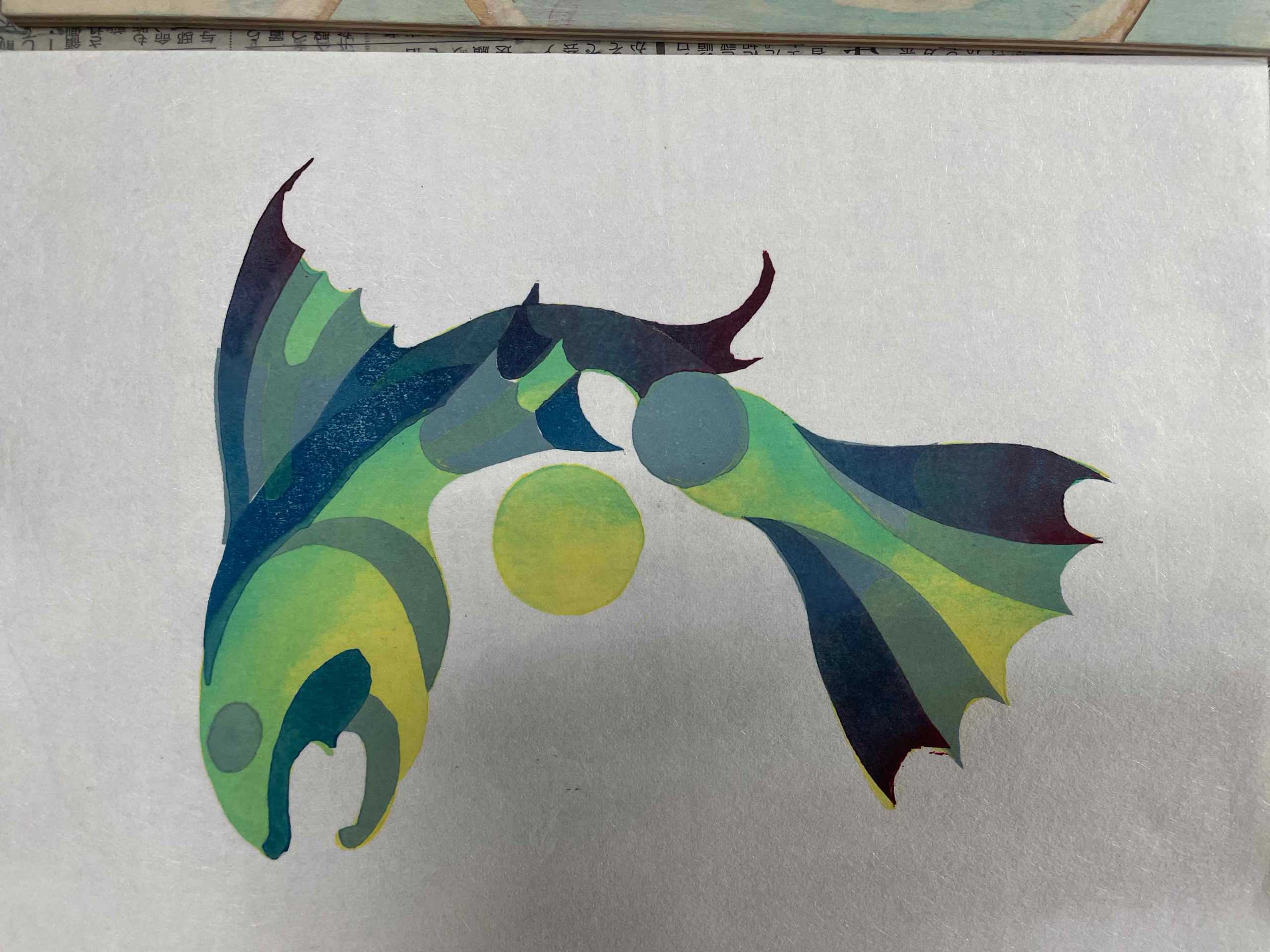
The second run (and edition of ten) was a bit better. Adding a gradient effect on some of the elements and using a more harmonious color scheme were both important.
We’re now tasked with developing at least two designs that are more ambitious. This process will run out for the rest of the residency.
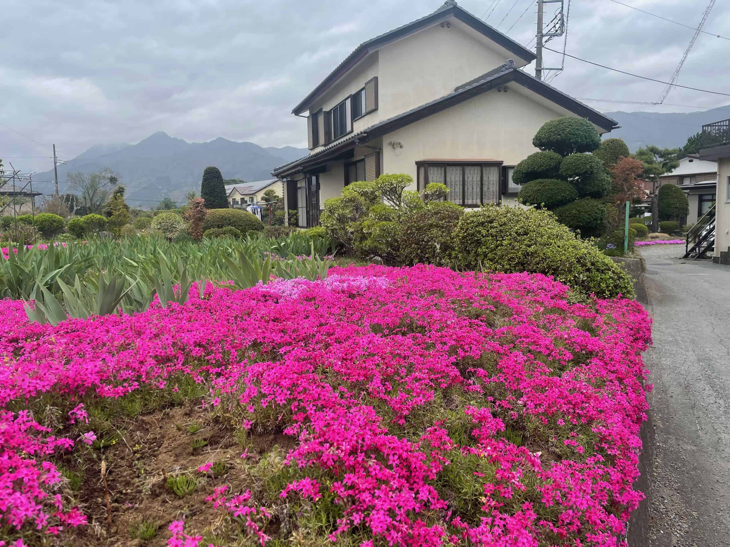
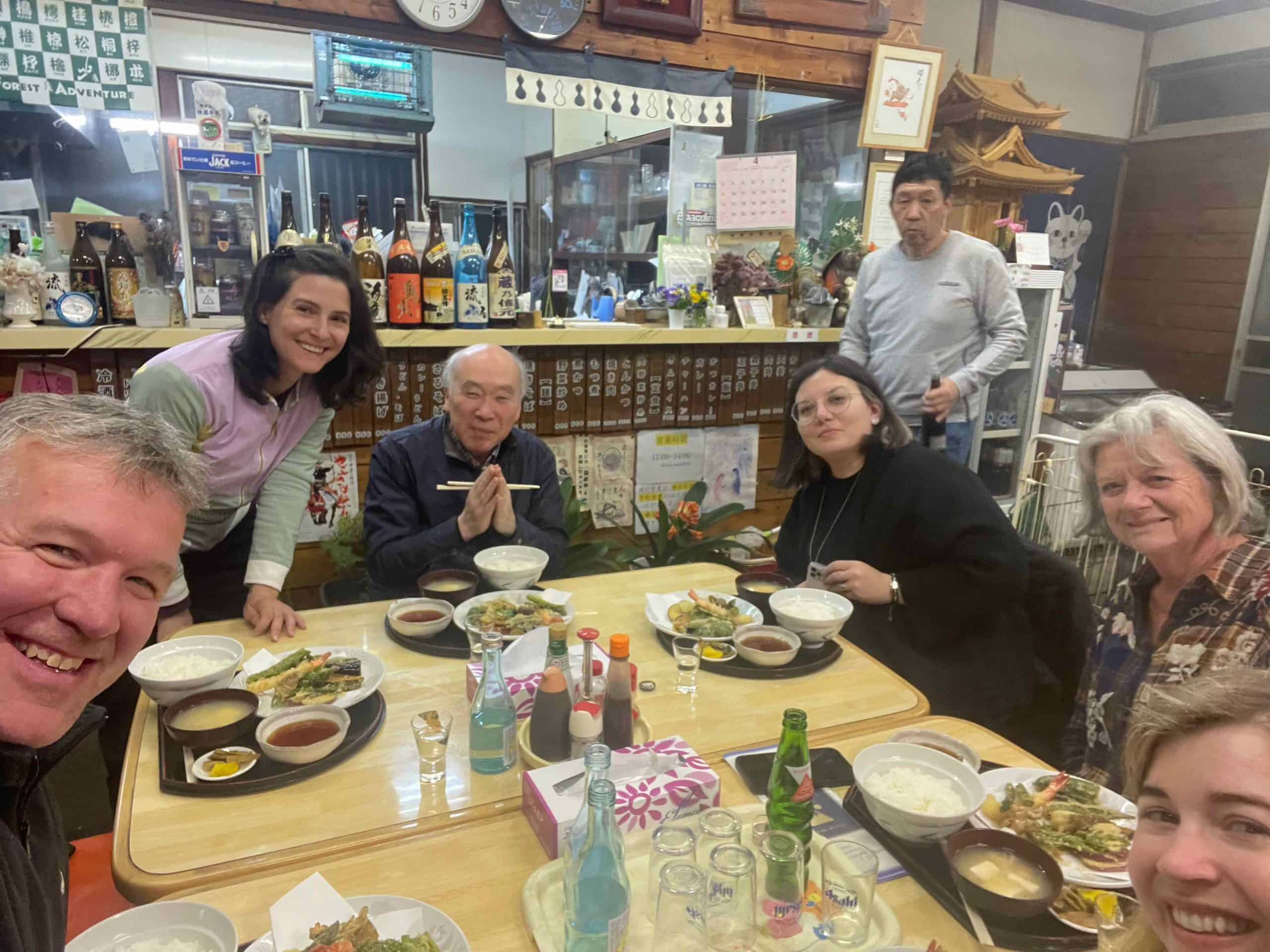
In the meantime, there’s been plenty of scope for exploring beautiful Fujikawaguchi town… including a spectacular tempura blow-out at a local restaurant last night.
0 Comments